Abstracts are fascinating, aren’t they? They look so simple, but like any good art, they come with a set of rules which are yours to learn and break. After reading Realistic Abstracts, (several times!) I was willing to give it a go. Poppies had just passed the season here, but I had several photographs to work from. Now, I needed a palette.

I’ve been keeping my palettes simple lately, generally 2 complementary colors and then various shades of each color. In search of the perfect palette, I found this lovely seafoam green, red and black palette from colorpalettes.net that seemed perfect.
I also watch an acrylic video by Jodi Ohl and studied the abstract artwork of Jeanie Gebhart, a fellow Denver artist. She has some lovely inspiration in her gallery. With all the above, I covered a 12×12 deep canvas and covered it with black gesso (like frosting!), added some titan buff and then a layer of seafoam green. Loved it!
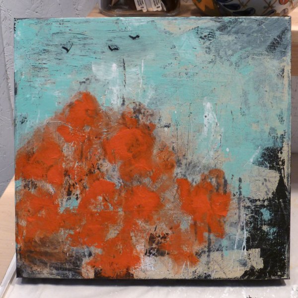
When I applied the seafoam green in the sky, I accidentally gouged out a V which ended up looking like a bird, so I added 2 more. Happy accidents! I got very attached to these birds and had a hard time letting go of them, but in the end I covered them over. Maybe next time…

Next step, block in the flowers with red. I chose 2 reds, a deep cool red and a warm orange red called napthol red light a heavy body acrylic by Liquitex. This is a gorgeous color and really blends well with the cooler red to make the perfect poppies.
I had in mind a field of poppies in the lower left, peaking just above midpoint and then s-curving down to the lower right. So far, so good…but now comes the hard part.
I’m stumped, what to do next? eek! I had no idea how to go forward. I knew if I painted flowers in detail then I’d be missing the abstract challenge…what to do, what to do…
Flowers aren’t that hard, some lights, some darks and a little deepest dark middle, right? Not if you want them to look abstract! So how do you make a flower look abstract? I’m learning…but the answer is somewhere in simplify, simplify, simplify. When I figure that out, I’ll be sure to post about it!
But carry on, I did with what I know and has worked for me in watercolors…some lights, some darks and a deepest dark center. Surprise! It actually had some wonderful appeal. The olive green was a good choice to set off the reds, but I like it so much it started going everywhere. Something was not quite right. I thought at first it was the sky, then the s-curve, then the flowers going off the right side, too much green..ugh! To tell the truth, I had no idea, but I wasn’t sold on it. So I put it up for the day and went to bed.

Fresh eyes, fresh morning and fresh composition. I decided it all had to go, including the birds! After all, I was just learning and playing, right? Out comes the black gesso, the titan buff and the seafoam green. I’ll spare you the details, but I had a double flower composition I thought would work…I was wrong. It got covered over as well.
On the third try, I remembered the mantra, simplify, simplify, simplify. So I reduced the field of flowers to 2, and then to 1 with a couple of buds to keep her company. I realized the green in the sky was overpowering, but I knew you needed to repeat colors in different areas of the painting to unify it, so I kept a bit of it.
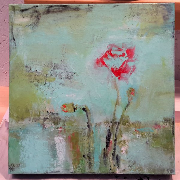
The rest is just try a stroke, leave it or wipe it off, or partially off, scrape it, water it down, try any technique I’ve learned and if it doesn’t work, try again until I liked it. After a while, I had a lower half that I was thoroughly happy with. A reward to keep me going!
Really different, isn’t it? But so much simpler and cleaner and more minimalist. I liked where it was going!
While I liked the minimalist appeal of the poppy, I was missing that wonderful napthol red orange. And I knew I couldn’t finish the background until I had it added so I could check my lights and darks for balance. Rather than a brush, I used some palette knives that were successful in the lower part. If you’ve never tried working with palette knives, they really keep you from getting too tight. I highly recommend them when you’re getting stuck.
I worked on that left side sky for the longest time. I thought I wanted black, then green, then a bit of red…over and over until I finally liked it. I know this is trial and error, but it’s also practice. How many times have we heard just practice as much as you can and oh, don’t forget to have fun too!
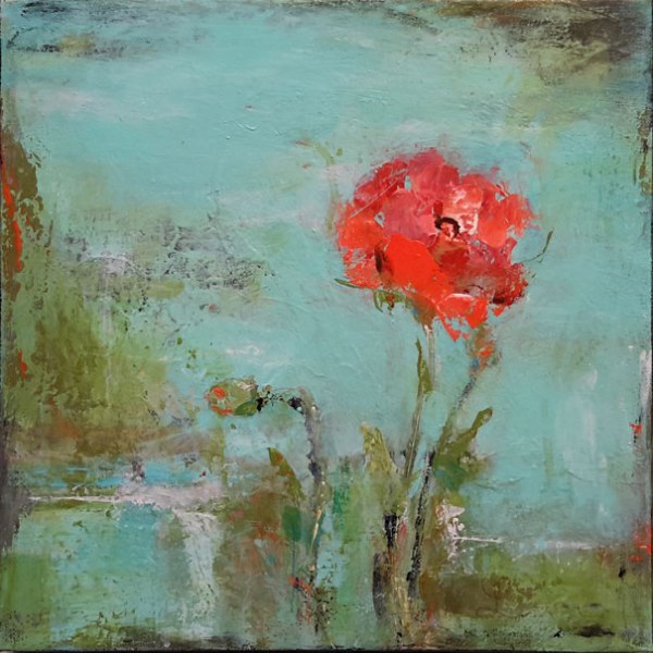
12×12 deep canvas, mixed media entitled “Poppy on Seafoam”, ready to hang. SOLD!
Looking for your comment? Thanks to SPAM, yours is in the sorting queue. Give it 24 hours!

Lovely abstract art!
LikeLike
Thankyou Evelyn!
LikeLike